
Records didn't start as a data quality layer.
It started because I needed to understand what FHIR data actually looks like — and no tool was helping me do that.
The designer problem
For more than a decade I built the UX and product strategy for a clinical documentation system at Uniklinik Cologne — first for DCLLSG, the Deutsche CLL Studiengruppe, supporting their clinical trials, then adapted for nNGM, the national network for genomic medicine. The system was in daily clinical use for over twelve years.
When the nNGM adaptation required mapping the system's freely designed forms to FHIR resources, I encountered the spec for the first time. The problem was immediately clear: I was designing forms and defining data structures without truly understanding what FHIR required on the other end. The mapping kept breaking — not because the forms were wrong, but because I didn't understand the profile constraints well enough to design toward them from the start.
For healthcare UX and UI designers, this is the hidden part of the interface: the screen may look like a form, but the product is also defining data that has to survive validation, exchange, and reuse. If the designer cannot see the FHIR constraints behind the form, the interface can look right while producing data that is hard to trust.
So I tried to understand the spec from the ground up. I pulled up the ISiK profiles in their 2022 form. I found example resources. I tried to build a mental model of what conformant clinical data should look like — not abstractly, but concretely enough to inform how the source systems needed to be structured.
It didn't work.
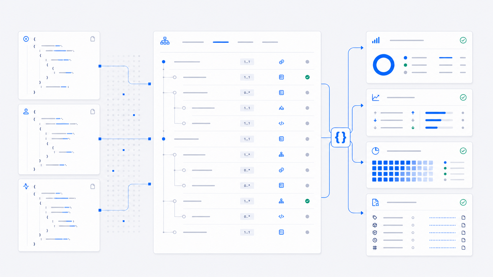
Raw FHIR resources are nearly incomprehensible without context. A JSON blob with nested references and coded values tells you almost nothing on its own. To understand what you're looking at, you need to know which profile applies, what that profile requires, which fields are must-support, what the coded values mean in context.
The data alone is not the data. The data plus its requirements is the data.
The tooling gap
The natural next step was to find a tool that would show me both — the resource and the profile it's supposed to conform to — side by side. Something that would let me browse real FHIR data and see, in real time, whether it met the requirements and where it fell short.
The HAPI FHIR Instance Validator was the obvious candidate. It's widely used, configurable, and built around FHIR's own conformance resources.
It couldn't do what I needed. Not because it was wrong — it validates correctly — but because it wasn't built for interactive exploration.
The output was technically useful, but not structurally explanatory. It told me that something was wrong and pointed to a path in the resource. What it did not synthesize was the relationship I needed to see: what is present in the resource, what the profile says should be present, and how each validation message changes that picture.
Even when the result was correct, understanding it meant mentally joining error paths, resource fields, and profile constraints by hand. Validating a resource took seconds. Browsing a dataset meant waiting. The feedback loop was too slow to actually understand anything.
I wanted to click through a dataset and immediately see: this resource is valid, this one has three issues, this field is missing, this code isn't recognized. Real time. No waiting.
That tool didn't exist.
The blind spot
So I started building a viewer. Something that would show a FHIR resource alongside its profile requirements, with validation results inline. Fast enough to browse. Clear enough for a designer to follow.
What I didn't expect was the second realization, which came from conversations with the FHIR engineers I was working with. When I described what I was building, every one of them said some version of: yes, we need this too.
That surprised me. These were experienced people who had been working with FHIR for years. They had HAPI. They had Inferno. They had every conformance test suite available. And they were saying the same thing I was: there's no good way to interactively see the relationship between data, profile, and validation state.
The other half of the surprise came from the designer side. Many designers working on medical software never see the FHIR constraints behind their screens. They don't always see that how the data is stored — what shape it takes, what fields it requires, what codes it binds to — directly determines what's possible in the interface. They were designing as if the data layer was someone else's problem. It wasn't. It just looked that way until something broke.
These two observations together — engineers who needed the tool but didn't have it, designers who needed to understand the data but didn't know how — made it clear this wasn't just my problem.
The insight
The deeper I went into building the viewer, the more I understood why the problem was harder than it looked.
A FHIR resource in isolation is ambiguous. The same resource might be valid against one profile and invalid against another. Without knowing which profile is assigned, you can't evaluate the data. Without knowing the validation state, you can't trust the data. Without knowing both, you can't understand the data.
These three things — the resource, its profile, and its current validation status — aren't three separate concerns. They're one thing. You need all three simultaneously, or you have none of them in a useful form.
That's what turned a viewer into a product.
What Records became
When I defined the combination — resource view, profile view, and data quality layer together — it was clear this wasn't just a better UI for a known problem. It was a solution to a problem the field hadn't fully named yet.
FHIR conformance is not a property of data. It's a relationship between data, the profiles applied to it, and the terminology sources those profiles reference. And that relationship changes over time — when profiles evolve, when terminology servers update, when environments diverge.
A viewer that shows all three simultaneously doesn't just help designers understand data. It gives anyone working with FHIR a single, honest answer to the question that no FHIR server can answer on its own:
Is this data valid right now? Against what? And how do you know?
Records is the answer to that question. It started because I, as a designer, couldn't understand FHIR data without seeing it in context. It became something more when I realized the context itself was what everyone was missing — engineers and designers alike.